Building a TripIt Visualizer in a few hours with Google Antigravity

We travel to see the world, but we track our travels to remember it. For years, I relied on TripIt to keep my travel history organized. But the API is no longer available and in their UI is hard to find older trips and get cool stats and visualizations.

Instead of losing that history, I spent a recent holiday afternoon building a custom solution: a TripIt Data Visualization site.

The initial motivation was simple: data ownership. I knew I could still get a JSON export of my data (thanks to GDPR), but a JSON file isn’t exactly “visual.”

🌍 See it in Action (Try the Sample Data)

You don’t need your own data export to see how it works. I’ve included a “Sample Data” mode so anyone can explore the dashboard immediately.

👉 Check out the demo here: tripit.csanchez.org

A web dashboard titled "Viewing Sample Data" showing four key statistics cards: 23 total trips, 34 flights (123,420 miles), 23 unique countries visited, and 206 days traveling. Below the stats is a dark world map with visited countries like the USA, Brazil, Australia, and parts of Europe highlighted in bright blue.
A dark-themed interactive world map displaying "Flight Paths." Numerous purple arced lines connect cities across the globe, showing a dense network of flight routes primarily originating from Europe and connecting to North America, South America, Africa, and Asia.
A "Yearly Statistics" bar chart tracking travel data from 2007 to 2026. The chart uses multi-colored bars to compare Days, Flights, Miles, and Trips per year, showing a significant peak in travel around 2019 and a visible dip during 2020-2021.
A clean user interface showing a list of "Past Trips" with cards for Auckland Nature 2025, Sydney NYE 2025, Oslo Summer 2024, and Summer in Europe 2024. Each card displays the destination, date range, duration in days, and number of flights.

The Goal: Beyond the Itinerary

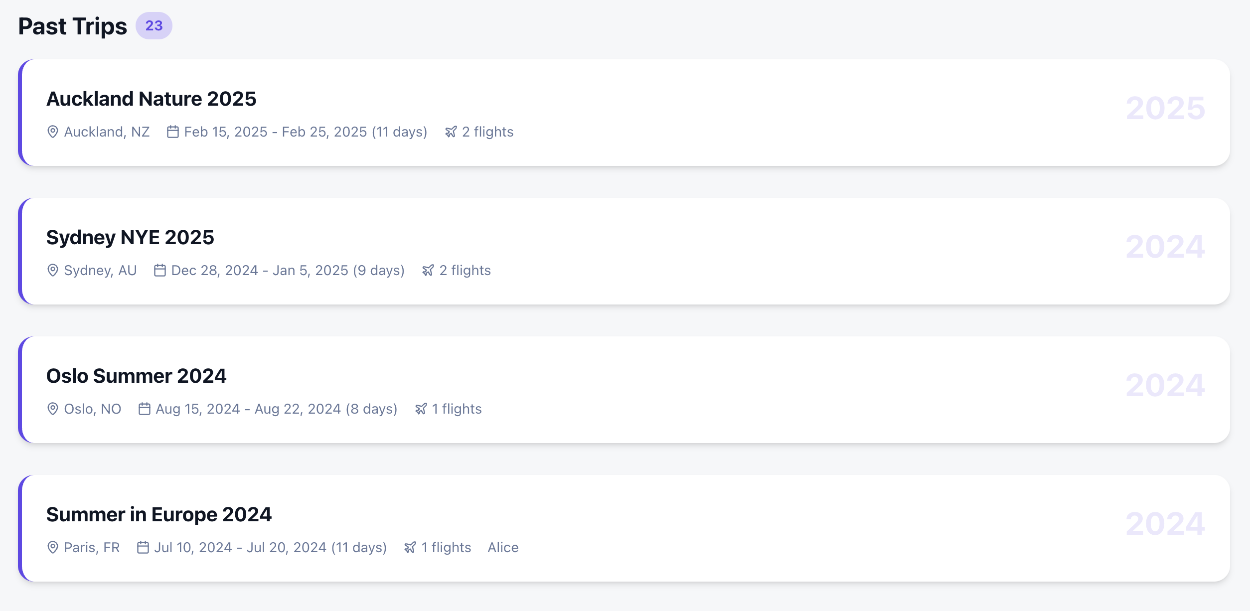
I wanted more than just a list of past trips. I wanted a comprehensive dashboard that felt like a mix of the best travel apps out there:

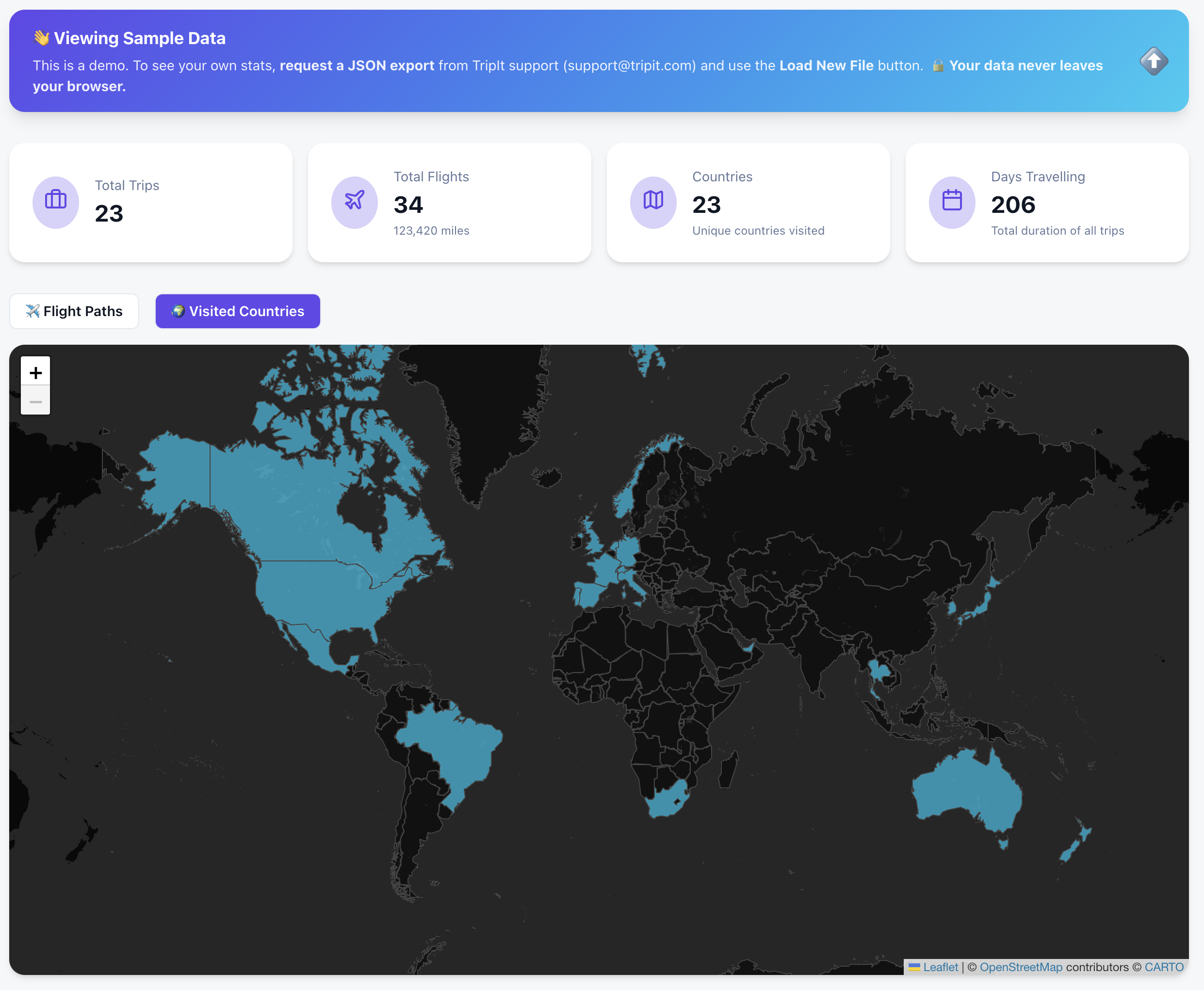
  • Countries Visited: A high-level view of global coverage.
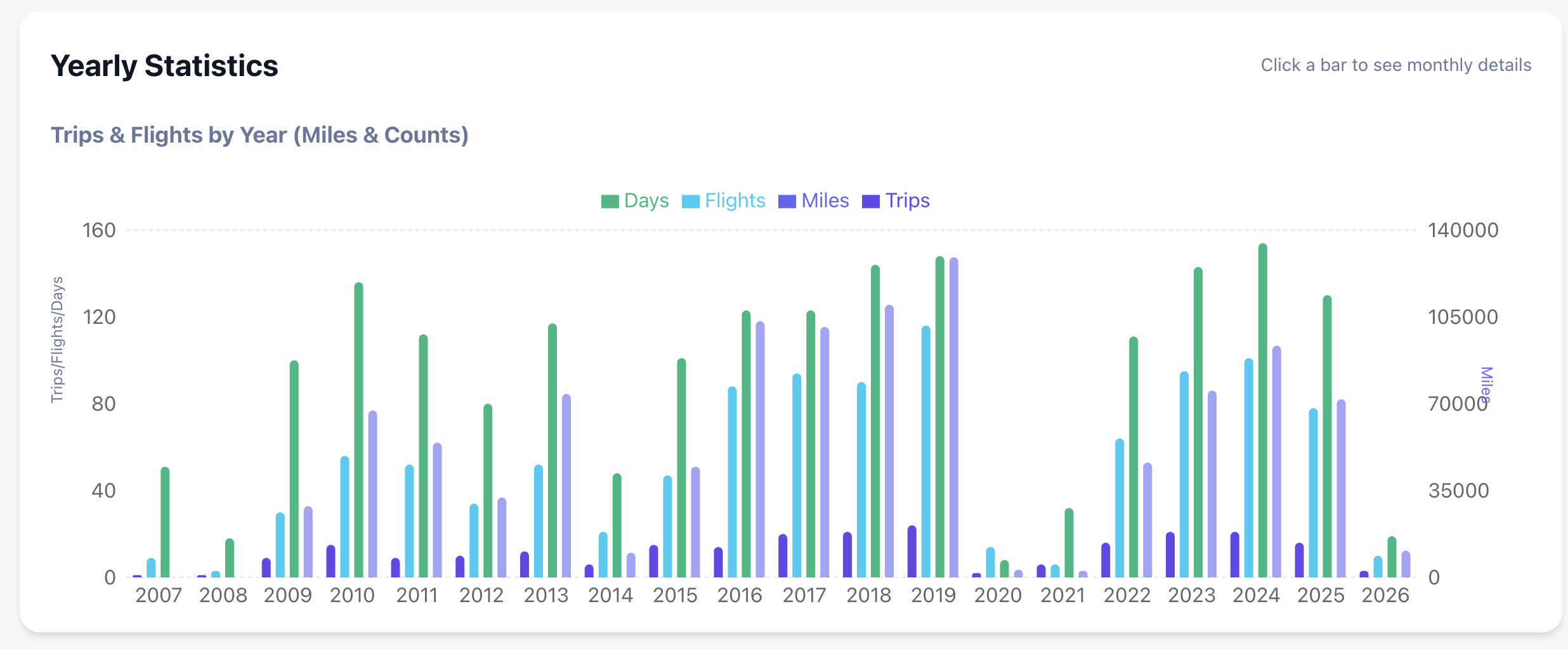
  • Deep Statistics: Yearly and monthly breakdowns of flights, miles, and airline preferences.
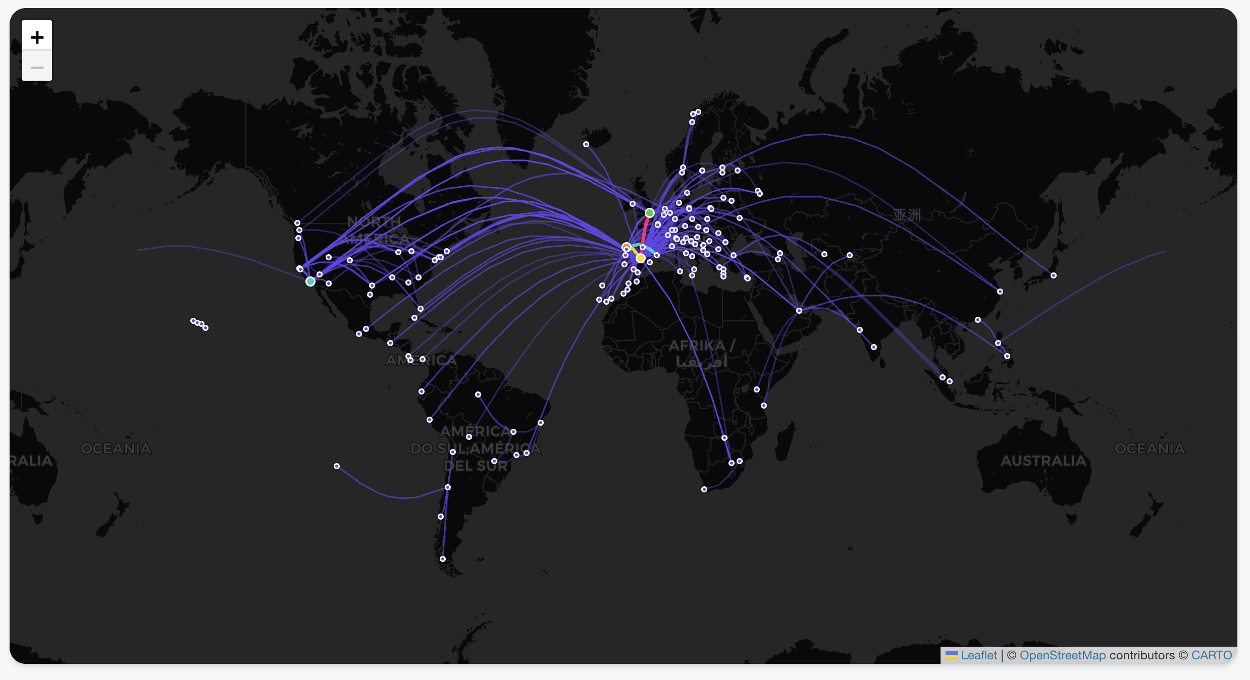
  • Interactive Flight Paths: View every take-off and landing as a beautiful arc on a global map.
  • Country Tracking: Automatically highlights every country you’ve visited based on your trip history.
  • Deep-Dive Statistics: Automated breakdowns of your travels by year, month, and even specific airlines.
  • Privacy-First Architecture: Your data never leaves your browser. There is no backend server storing your history; it’s all processed locally using your tripit export.
  • Zero Friction: Don’t have your data yet? You can explore every feature using the Gemini generated Sample Data .

The Secret Sauce: Building with Google Antigravity & Gemini

The most remarkable part of this project wasn’t the code itself, but how fast it came together. The entire project took just a few hours, and complex visualizations were trivial to add. Which also hooks you into adding more and more features as it is too easy!

I used the Antigravity browser, which allowed for a feedback loop with Gemini. Instead of manually debugging CSS or layout issues, I could:

  1. Ask Gemini for a design change or a new feature.
  2. The AI would “see” the current state of the app via screenshots.
  3. It would provide the fix or the code block instantly based on the visual context.

This “visual-first” development meant I could spend more time on the logic of the data and less time wrestling with the UI.

Privacy First: Your Data Stays Yours

I wanted to ensure this tool was 100% private.

  • Since there is no API, you need to request a JSON export from TripIt (thank you, GDPR!).
  • Your data never leaves your browser. It’s processed locally, visualized, and saved for the next time you open the page.

📁 GitHub: carlossg/tripit-view

Managing the Machine: A Practical Look at Google Antigravity

By now, most of us have experimented with AI coding. But while tools like Cursor have mastered the “co-pilot” experience—keeping you in the flow of writing code—Google Antigravity (released late 2025) is trying something different. It is an agentic IDE where your primary job is reviewing “Artifacts” rather than syntax.

One of the killer features is the Browser Integration.

The Browser as a “Feedback Loop”

In Antigravity, the built-in browser isn’t just for documentation; it’s a sandbox for the AI agents. When an agent implements a UI change or a new route, it doesn’t just hope the code works. It can:

  • Self-Verify: Open a headless window to check if a component actually renders.
  • Visual Debugging: Use DOM inspection to fix styling bugs that text-based models usually struggle with.
  • Artifact Generation: It produces browser recordings and screenshots so you can verify the “Mission” was successful without having to manually run the build yourself.

It’s less about “the AI browsing the web” and more about the AI having a way to prove its work to you before you merge.


The Reality of the Free Tier: Knowing Your Quotas

The biggest change in the 2026 version of Antigravity is the move to Weekly Quotas. Instead of a daily reset that might cut you off mid-task, you now have a larger “bucket” of usage that refreshes weekly.

Here is how those limits are structured for Free Tier users:

CategoryQuota TypeKey Detail
Gemini ModelsDedicated per ModelGemini 3 Pro and Gemini 3 Flash each have their own separate weekly allowance. If you run out of Pro, you can still use Flash for lighter tasks.
Claude ModelsShared PoolAll non-Google models (Claude 3.5/4.5 Sonnet and Opus) share a single combined bucket. High-intensity work with Opus will drain the same quota you use for Sonnet.
CompletionsUnlimitedStandard inline tab-completions do not count toward your weekly agent/chat limits.

The Strategy: Staggering Your Usage

Because of this “separate vs. shared” structure, the smartest way to use Antigravity is to stagger your models:

  1. Use Gemini 3 Pro for your initial architectural planning and browser-heavy UI tasks.
  2. Switch to the Claude pool only when you need a “second opinion” on complex logic or specific refactoring patterns where Anthropic’s reasoning shines.
  3. Save Gemini 3 Flash for documentation questions and basic unit test generation to preserve your “Heavy Reasoning” buckets.

Final Verdict

Antigravity isn’t a “Cursor killer”—it’s a different workflow. While Cursor is for when you want to be the pilot, Antigravity is for when you want to be the air traffic controller. Just keep a close eye on your Claude shared pool; if you’re not careful, a single complex feature build on Monday can leave you without Claude access for the rest of the week.